Custom Dashboard provides the facilities to choose type of widgets to display on dashboard It also have data filters to update widgets as per requirement. It is allowing the user to have their own custom dashboard.
In order to give an access to user, we have “Custom Dashboard” option under Access Rights as mentioned in below screenshot:
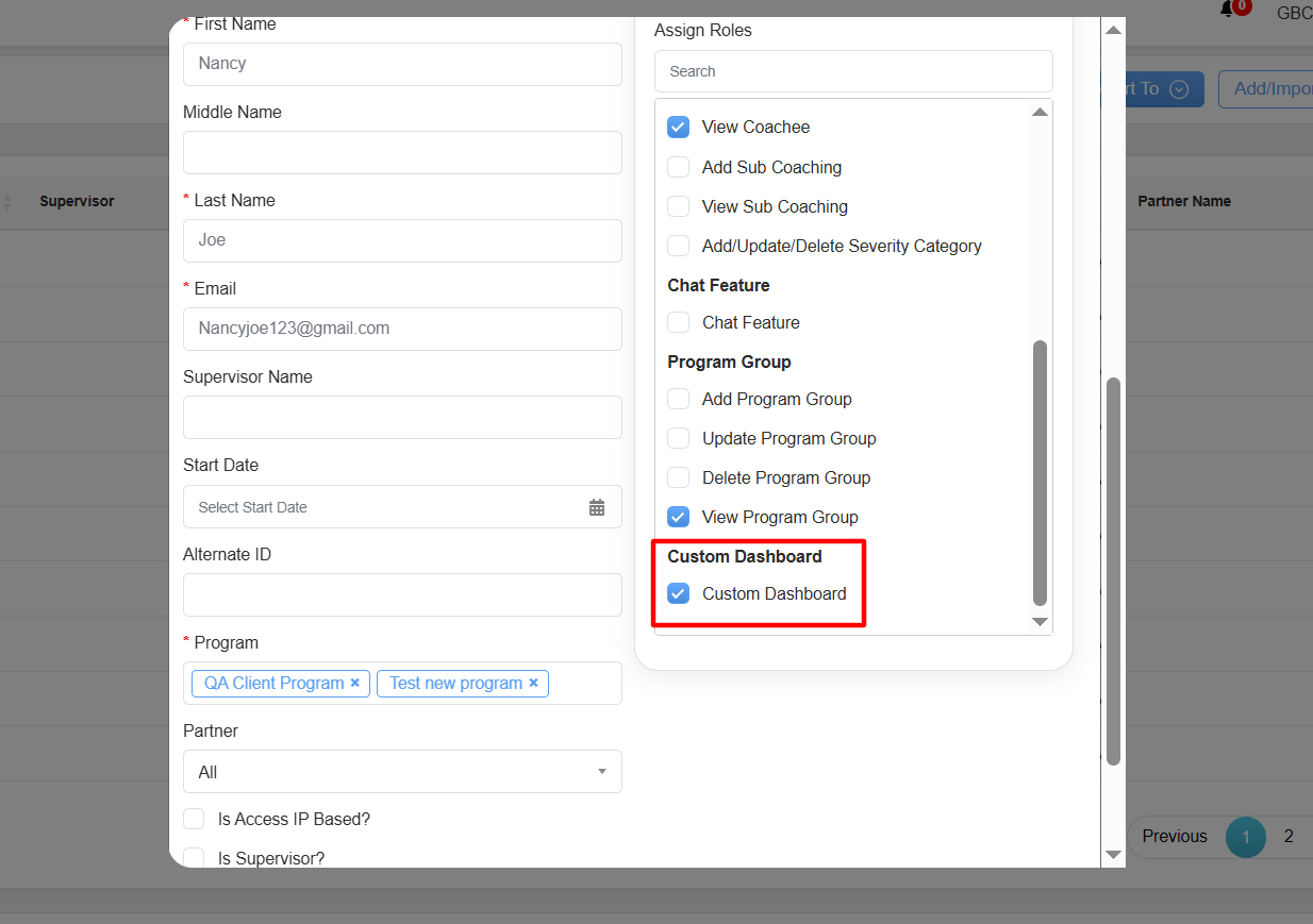
User: Custom Dashboard
Refer to User to know how to add and modify the user access rights.
The user can view and access the Custom Dashboard by clicking on the Menu ![]() button or move the mouse on the left side of the page to open the Menu Bar, then click on the Home
button or move the mouse on the left side of the page to open the Menu Bar, then click on the Home ![]() option and select Custom Dashboard as shown in the screen below:
option and select Custom Dashboard as shown in the screen below:
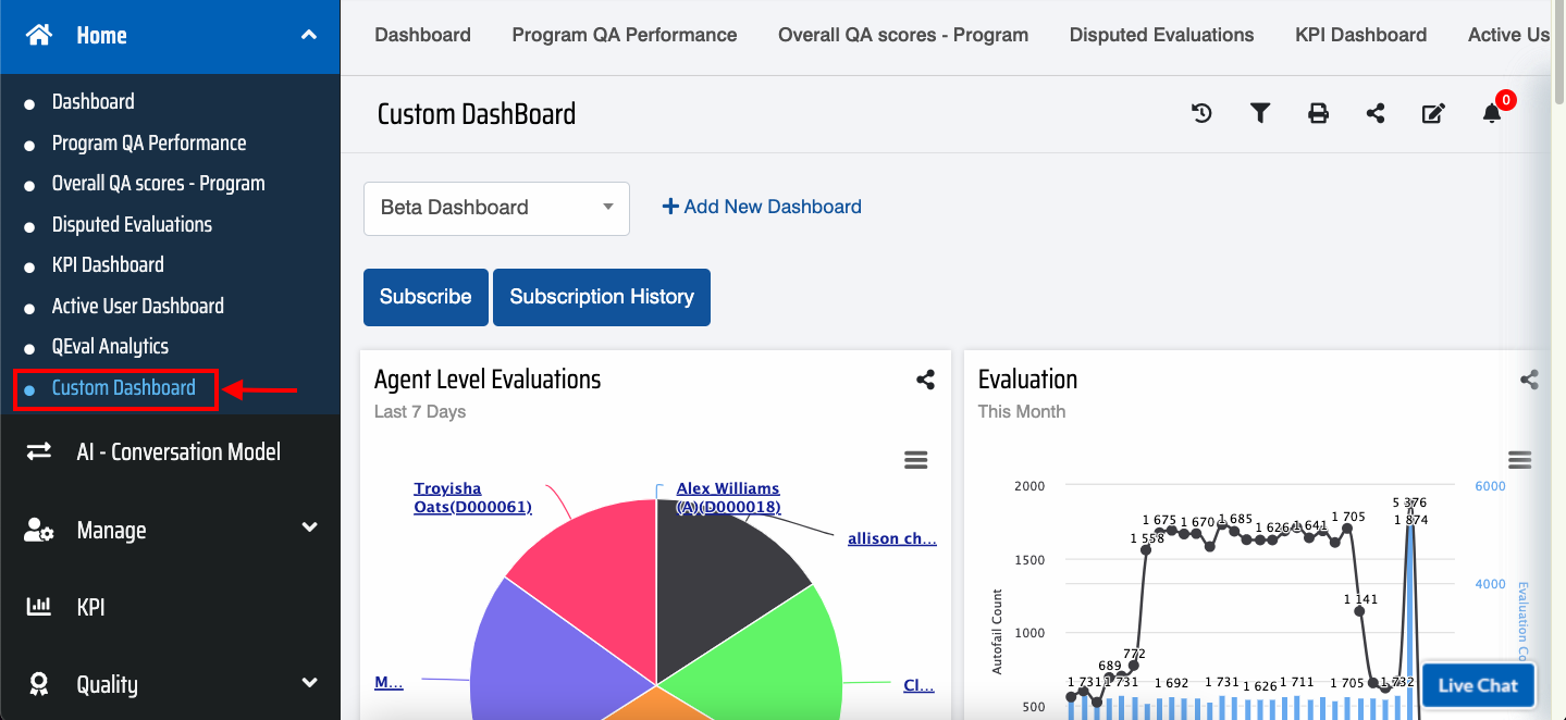
Custom Dashboard Option
The logged-in user can also access this functionality by clicking on the More option and click Custom Dashboard tab displayed on the dashboard page as shown below:
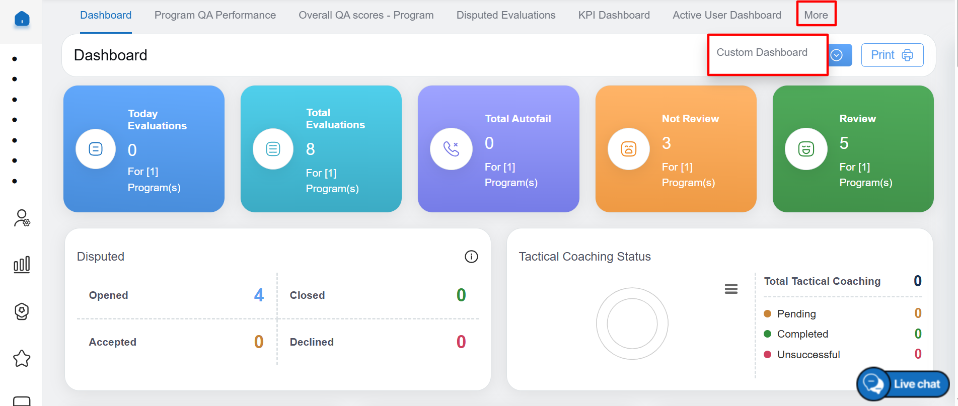
More: Custom Dashboard
When you open custom dashboard, you will get an option of short description about the items available in it. You can click on “Next” button in order to see each item’s description or you can simply click on “x” button.
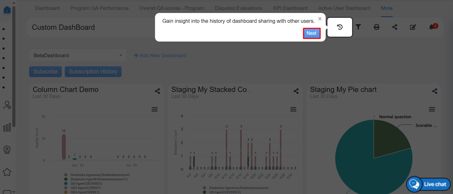
Insights of Custom Dashboard
We have an option to add new dashboard when you are configuring first time custom dashboard. It provides functionality to group widgets of common insights into one dashboard. Click on “Add New Dashboard”, it will pop up below mentioned option to fill the details and then click on the Add button as shown below:
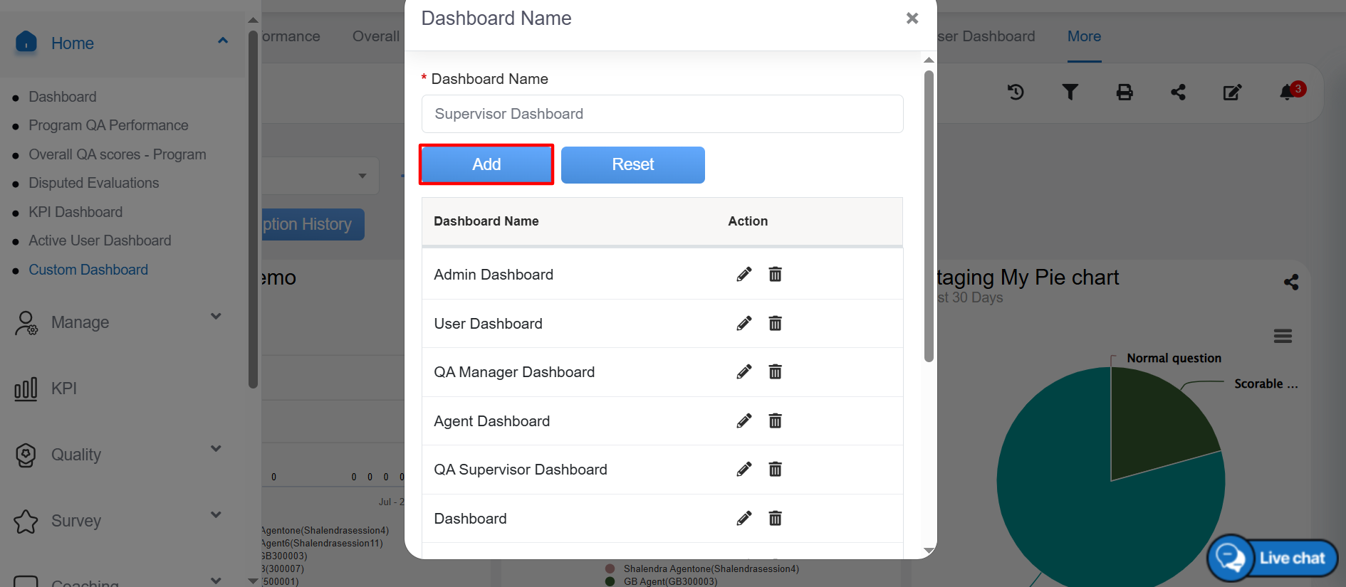
Add New Dashboard
An acknowledgment message will be displayed on the page and the new customised dashboard will be created. Click on Ok button to close the message.
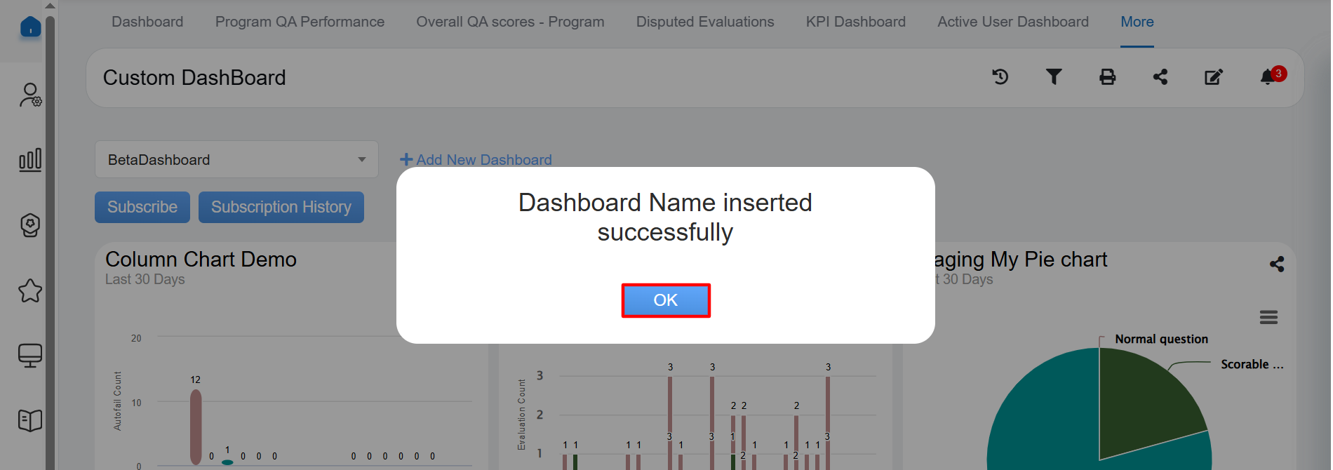
Acknowledgement Message
Once the new dashboard name will be added, it will be added in the dropdown as mentioned in below screenshot:
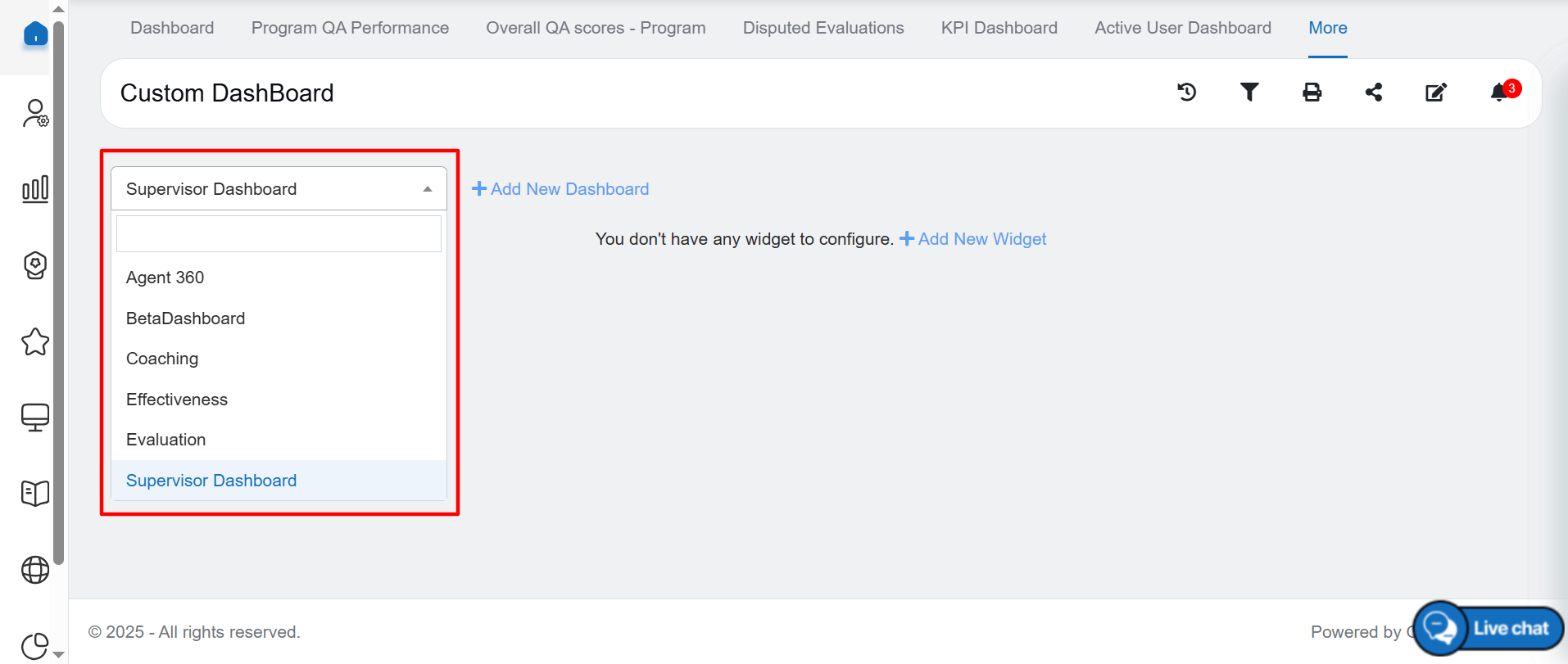
List of Dashboard Names
In order to add new widget, click on “Add New Widget” option after selecting dashboard name from the dropdown.
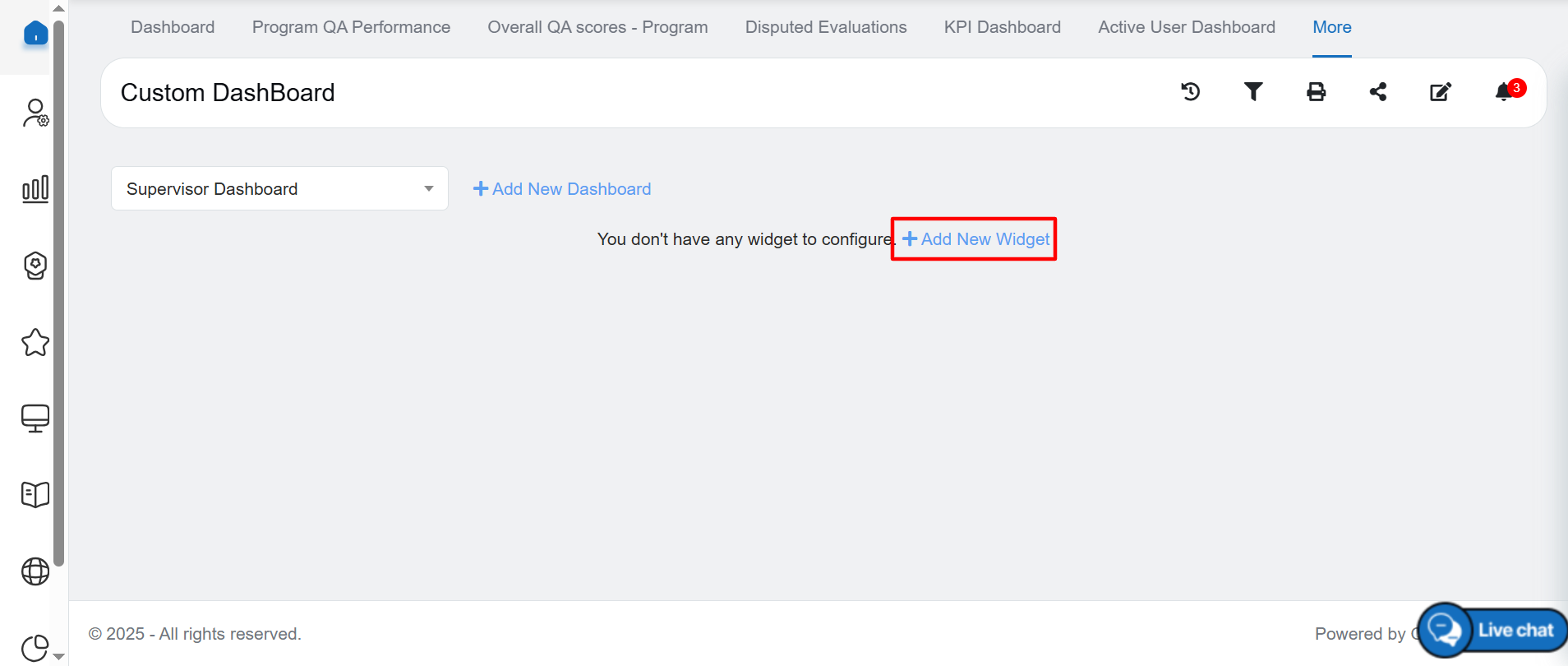
Add New Widget
The Add New Widget window will be opened. Click on the Select drop-down menu the list of different charts will be displayed.
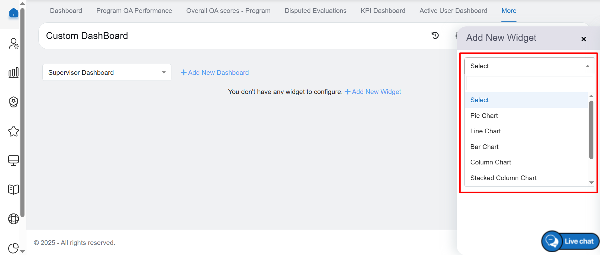
List of Charts
There are seven types of charts available in custom dashboard as mentioned below:
- Bar Chart
- Pie/Tile Chart
- Line Chart
- Column Chart
- Stacked Column Chart
- Dual Axes Chart
- KPI Type
Upon selecting a Bar chart type, a new blank widget is automatically created on the dashboard as mentioned in below screenshot
- Bar Chart: Bar chart includes multiple campaign selection. Trend Daily, Weekly, Monthly and Overall options are there for Bar chart. Attribute and Trend Toggle option are also there in this chart to toggle the representation of data between x-axis and y-axis.
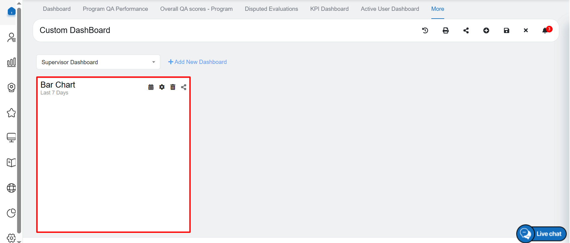
Bar Chart
Bar Chart details
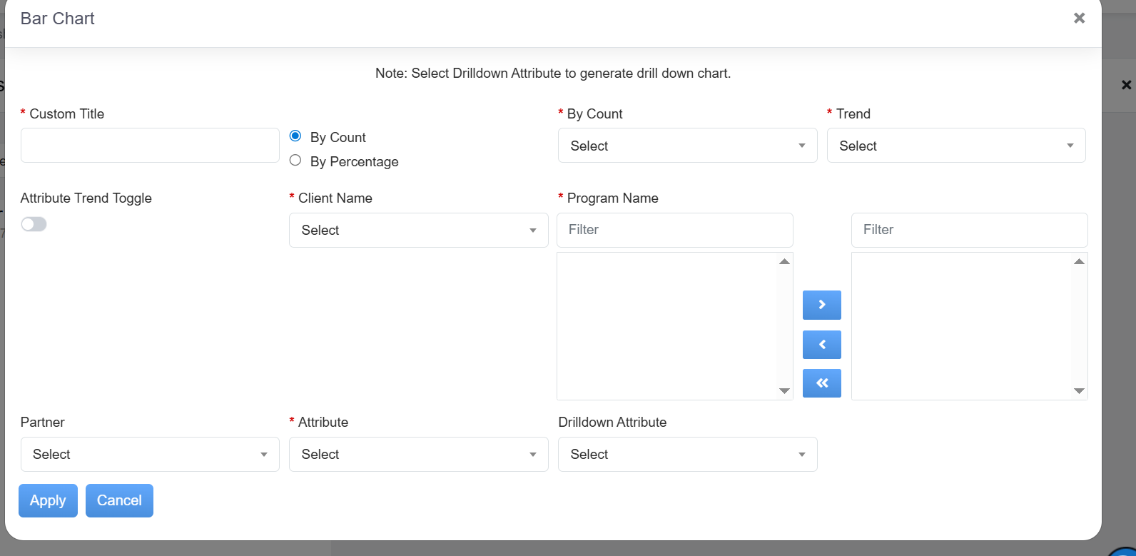
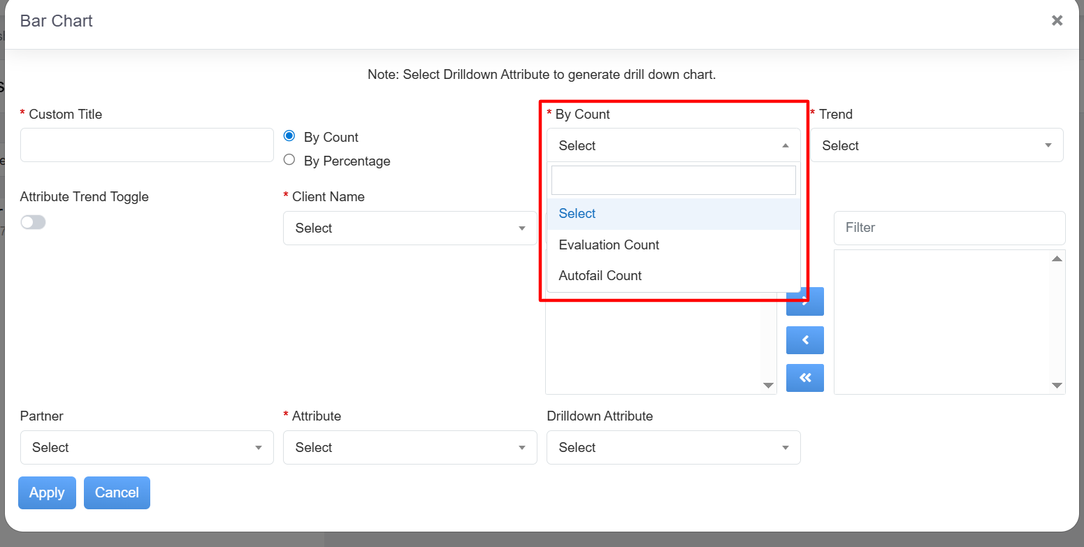
Once you click on “Setting” icon, it will pop below mentioned screenshot where we need to fill the details and select the option as per our requirement which shows in mentioned chart:-
Custom Title:- Mention title of the chart name.
By Count:- It will have an option to get the details as per evaluation count and autofailure count for bar chart as mentioned in below screenshot:-
– Evaluation Count
– Autofail Count
For other charts, we do have an option as mentioned below:-
– Reviewed
– Disputed Open
– Disputed Close
– Tactical Coaching
By Count Dropdown
By Percentage:- It will have an option to get the details as per evaluation percentage with autofail %, without autofail % and Autofail % options for bar chart as mentioned in below screenshot:-
– With Autofail %
– Without Autofail %
– Autofail%
For other charts, we do have an option as mentioned below:-
– Reviewed %
– Disputed Open %
– Disputed Close %
– Tactical Coaching %
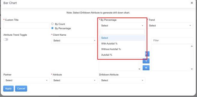
By Percentage Dropdown
Trend:- It allows to select daily, weekly, monthly and overall options as mentioned in below screenshot:-
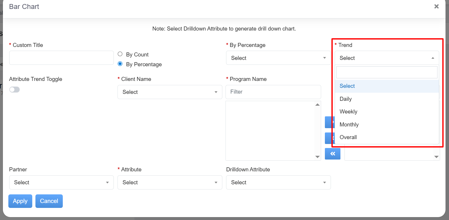
Trend Dropdown
If it is trend level weekly option, it will show in a pop-up window of Legend For Week with Week No. & Dates as mentioned in below screenshot:-
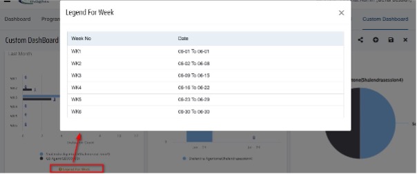
Legend for week
Attribute Trend Toggle:- Toggle attribute trends on or off as needed to enhance data visualization. This option hides when overall option selected from either Trend or Attribute dropdown.
Client Name:- Select client name from the dropdown.
Program Name:- Select the program name from the dropdown.
Attribute:- Select specific attributes to be analyzed on the widget for detailed insights. Attribute options are as follows:-
– Agent
– Supervisor
– Location
– Disposition
– Sub Program
– Partner
– Category
– Question
– Overall
– Program
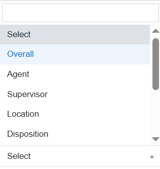
Attributes
Maximum 10 Attribute types can be selected by ticking the checkbox as mentioned in below screenshot:-
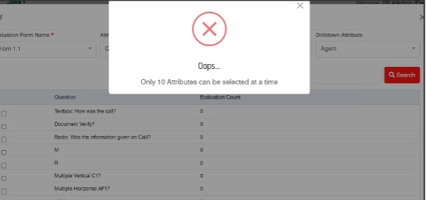
Dialog Box
Based on attribute selection, below mentioned options are enabled for drilldown attribute selection:-
Drilldown Attribute:- It allows to select drilldown attribute of the options which we have selected in the attribute option. It enables attribute-level drilldown for a more granular analysis of your data. Drilldown Attribute options are as follows.
– Agent
– Supervisor
– Location
– Disposition
– Sub Program
– Partner
– Category
– Question
– Answer
Once all the details are filled and selected, click on “Apply” button to show the chart or “Cancel” to discard the changes.
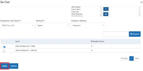
Apply Button
All changes are applicable only when user click on “Save” dashboard button on the upper right side of the custom dashboard. When new widget is added in dashboard, user cannot add another widget until that widget is saved or deleted.
It will show the chart as mentioned in below screenshot:-
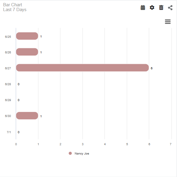
Bar chart last 7 days
We do have an option to change the date by clicking on “Calender” icon in the chart itself. We do also have custom range to select the date range, you can select date range as per your requirement as mentioned in below screenshot:-
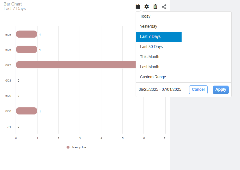
Calendar Option
In order to edit/modify the fields for the chart, we have a “Setting” icon. Once you select this icon, it will open the same pop in which we have added the details. In that, you can edit/modify the options.
“Delete” icon allows to delete the specific chart from the custom dashboard.
We do have “Share” icon available in order to share the chart through email, it allows to share the configuration to particular user and can setup alerts by selecting benchmark. Under “Share” icon, we have 3 options available:- Email, Configuration & Alert.
-Email sharing allows to share the chart via email. When we click on “Email” sharing option, it will open below mentioned pop-up window:-
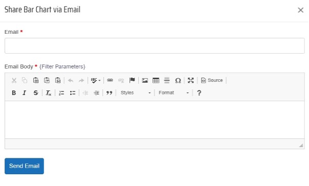
Share Bar Chart
It allows to mention the email ID of the user in “Email” and email content to be mentioned in the “Email Body”. Once the details have been filled, click on “Send Email” button, it will trigger an email to the respected user.
– Configuration option allows to send the same chart configuration to the respected user. Once you click on “Configuration”, it will open below mentioned pop-up window:-
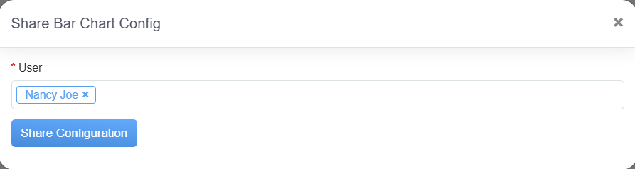
Share Bar Chart Config
In this, you can select the multiple users and then you can click on “Share Configuration” button.
-Alert option allows to set the benchmark and accordingly it triggers an alert notification. Once the benchmark has been set, click on “Set” button as mentioned in below screenshot:-
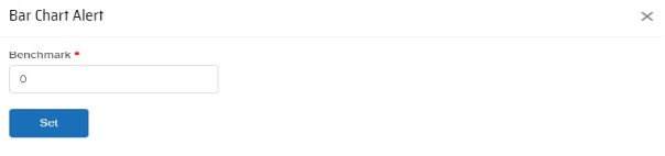
Bar Chart Alert
Custom dashboard includes history, date filter, print, share, edit, notification icons and button to create new dashboard as well as select dashboard from existing dashboards for dashboard grouping.
Once particular dashboard is selected from dropdown, the user can add, update, save, print or delete widgets from Edit Dashboard.
Shared History:- Gain insight into the history of dashboard sharing with other users.
Date Filter:- Easily select a date range to filter data for comprehensive visualization of the dashboard.
Print:- Save the dashboard as a PDF for convenient sharing with colleagues or stakeholders.
Share Dashboard:- Seamlessly share the dashboard with third-party recipients via email or QEval users.
Edit Dashboard:- Customize or update widgets on the dashboard to suit your specific needs.
Notifications:- Stay informed with all relevant notifications and alerts through the notification bell icon, ensuring timely responses and actions.
In the same way, we can configure different charts in the custom dashboard as mentioned below:-
- Pie/Tile Chart:- This chart includes multiple campaign selection. Trend Overall option is there for Pie/Tile chart and user can select chart type from widget settings.
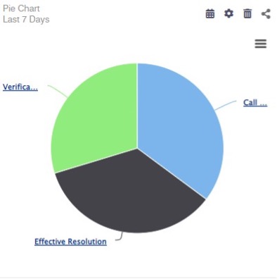
Pie Chart
- Line Chart:- Line chart includes multiple campaign selection. Trend Daily, Weekly and Monthly options are there for Line chart.
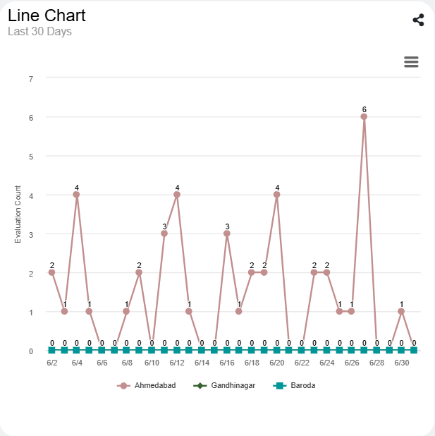
Line Chart
- Column Chart:- Column chart includes multiple campaign selection. Trend Daily, Weekly, Monthly and Overall options are there for Column chart. Attribute and Trend Toggle options are also there in Column chart to toggle the representation of data between x-axis and y-axis.
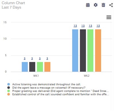
Column Chart
- Stacked Column Chart:- Stacked Column chart includes multiple campaign selections. Trend Daily, Weekly, Monthly and Overall options are there for Stacked Column chart. Attribute and Trend Toggle options are also there in Stacked Column chart to toggle the representation of data between x-axis and y-axis.
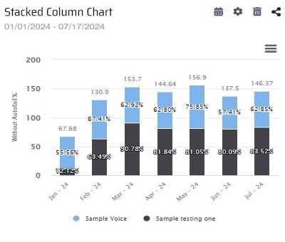
Stacked Column Chart
- Dual Axis Chart:- Dual Axis chart includes single campaign selection. Trend Daily, Weekly and Monthly options are there for Dual Axis chart and there is Overall in Attribute dropdown. There are By Count/ By Percentage dual dropdown option for second axis.
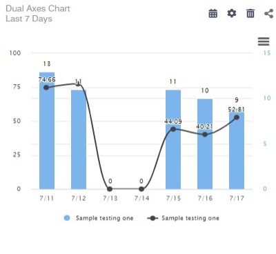
Dual Axes Chart
- KPI Type:- As this chart used to represent single value, we have single Campaign selection for this chart. Trend dropdown and Attribute dropdown has Overall option for this chart.
Once every charts has been configured, you can see custom dashboard as mentioned in below screenshot:-
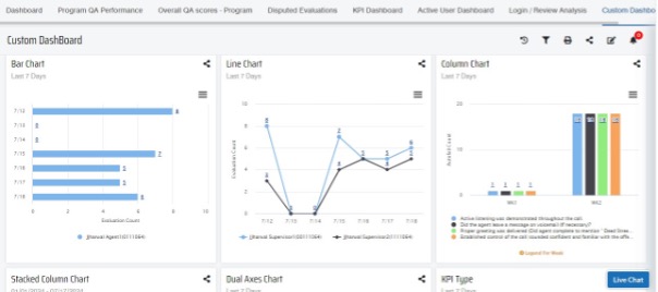
Custom Dashboard
Note :- User can resize or reposition widgets as per requirement in the dashboard by drag and drop feature.
The user can switch to a different custom dashboard by selecting an option from the Dashboard dropdown menu, as shown in the highlighted section below-
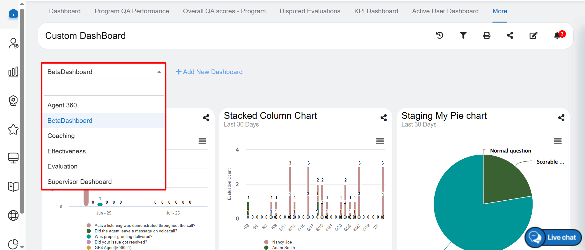
Custom Dashboard Drop-down
Subscribe
Once the custom dashboard is generated based on the selected filters, click on the Subscribe button to schedule the specific report as highlighted in the screen below:
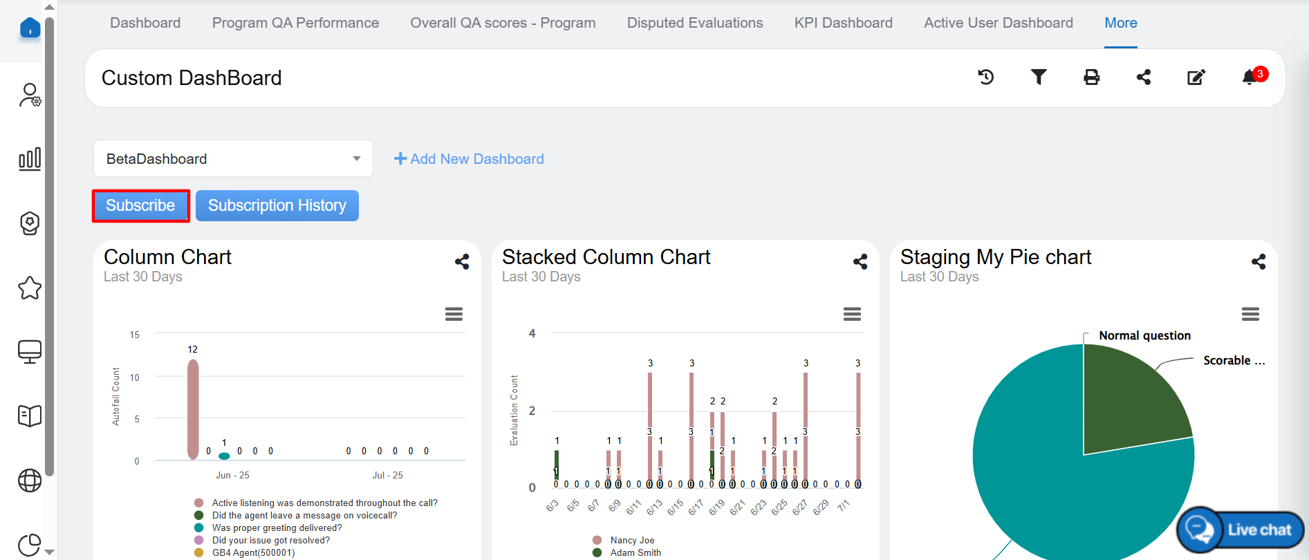
Subscribe
Upon clicking on the Subscribe button, the following Dashboard Subscribe popup window will be displayed –
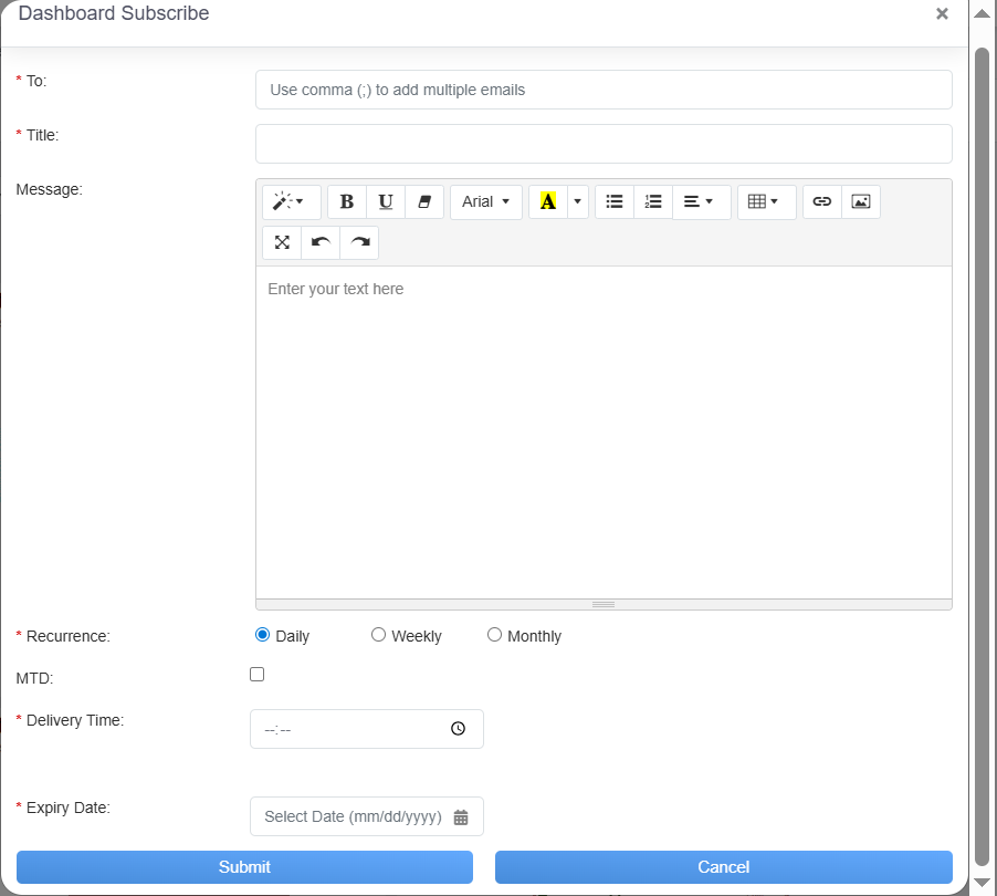
Dashboard Subscribe
The data elements displayed on the screen are explained below:
- To: Mention the email ID to whom you need send a report. You can add multiple email IDs and separate it by semi-colon.
- Report Title: Add the title of the custom dashboard.
- Message: Mention the content which you want to add under email body.
- Recurrence: It shows Daily, Weekly, Monthly. This means it schedule the report weekly, monthly or you need only once, you can select as per your requirement.
- When the Recurrence as Daily is selected you need to select
- MTD: Select the Month to Date check box, if required.
- Delivery Time: Select the timing for report delivery.
- Expiry Day: Select the expiry date on while the report scheduling will stop.
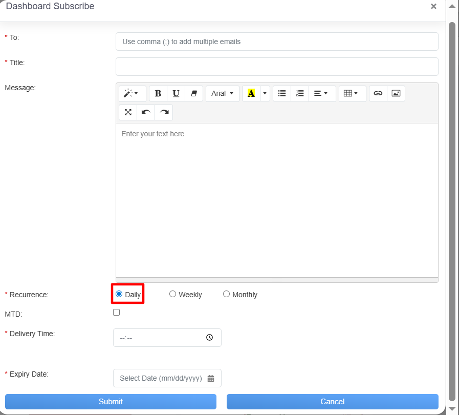
Daily Recurrence
When the Recurrence as Weekly is selected you need to select
- MTD: Select the Month to Date check box, if required.
- Delivery Time: Select the timing for report delivery.
- Selected Days: You can select the days by clicking on the checkbox for which it will trigger an email notification on every week on that day. E.g. If you select “Monday” & “Friday”, it will trigger an email notification for the report on every Monday & Friday of the week.
- Expiry Day: Select the expiry date on while the custom dashboard scheduling will stop.
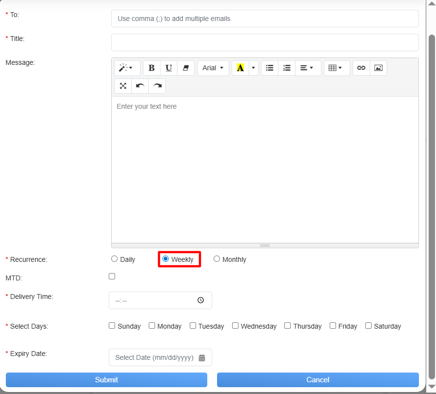
Weekly Recurrence
When the Recurrence as Monthly is selected you need to select
- Delivery Time: Select the timing for report delivery.
From On the following day and On this day of the month select any 1 option
- On the following day: It allows to select the date and the day of the specific month for which the custom dashboard will be scheduled
- On this day of the month: It allows to select the date of the month for which the custom dashboard will be scheduled.
- Expiry Day: Select the expiry date on while the report scheduling will stop.
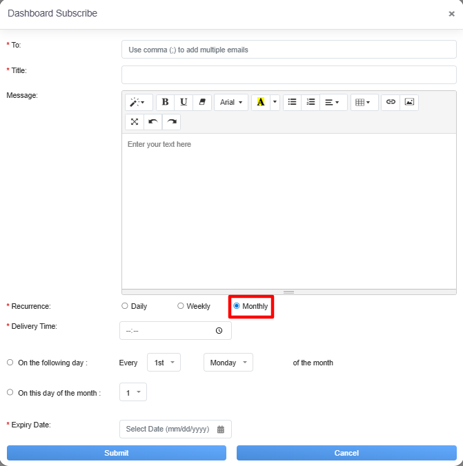
Monthly Recurrence
Once the necessary details are configured, click on the Submit button to subscribe the custom dashboard or click on the Cancel button to discard the process.
Subscription History
The Subscription History feature allows the user to view a complete record of subscription activities, including plans, renewals, and modifications, for better account management and transparency.
To access this functionality, click on the Subscription History button, as highlighted in the screen below-
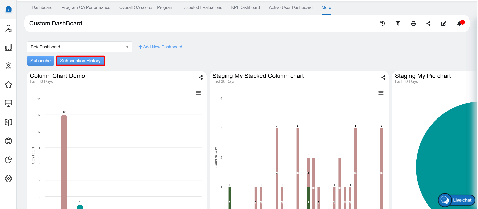
Subscription History
Upon clicking on the Dashboard Schedule Grid button, the Subscription pop up window will be displayed –
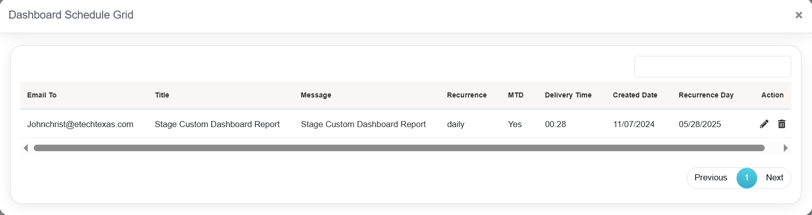
Dashboard Schedule Grid
Click on the Edit button to update the specific dashboard grid as highlighted in the screen below-
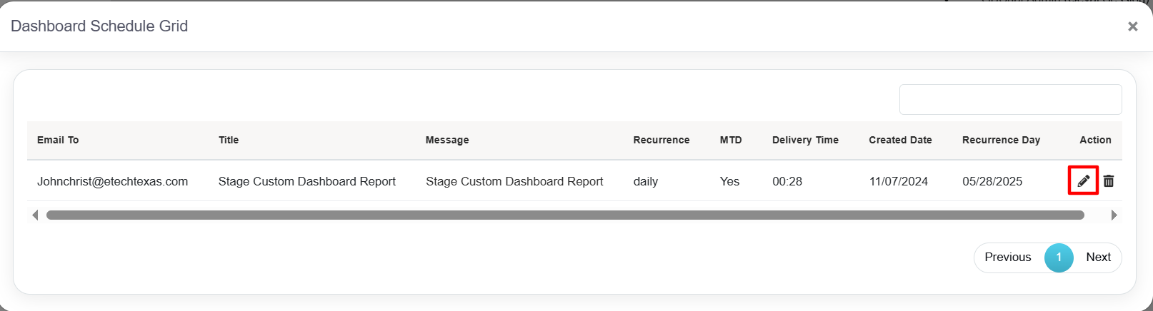
Edit Button
Clicking the Edit button will open the Dashboard Subscribe pop-up window. Update the details as needed, then click the Update button, as shown in the highlighted section below-
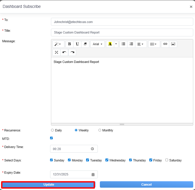
Update
An acknowledgment message of successfully dashboard subscription will be displayed on the screen.
To remove a subscription, select the delete option, as shown in the highlighted section below –
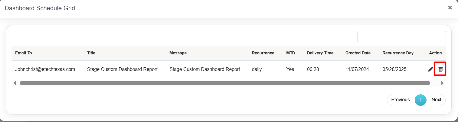
Delete Button
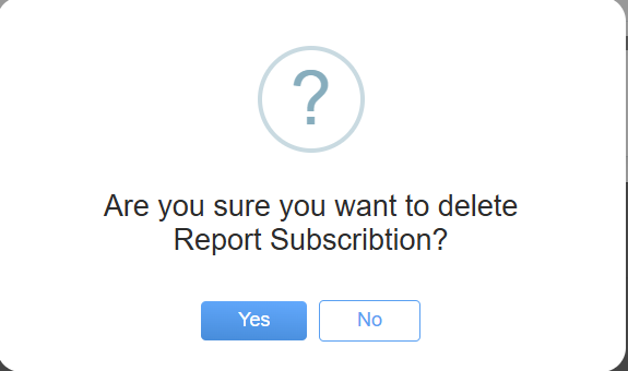
Upon clicking, a confirmation pop-up will be displayed, prompting you to confirm the deletion.
Confirmation Pop-Up
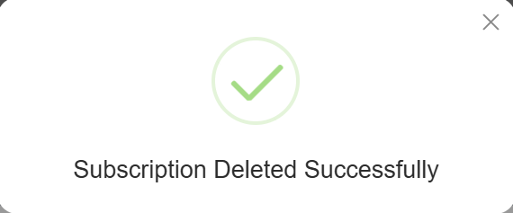
Upon clicking the “Yes” button, a confirmation message will appear on the screen, indicating that the report subscription has been successfully deleted from the system.
Acknowledgement of Successful Deletion
Video